Identity for the Hygiene Museum, St. Petersburg
We created three design concepts and presented them to the management of the Municipal Center for Medical Prevention, which owns the museum. After discussing the concepts, we decided to start an open vote. As a result, the choice of almost 800 people matched the choice of the management and the hygiene museum in St. Petersburg got a corporate identity.

Retrospective look at hygiene
Studying the history of hygiene, we learned a lot of interesting things about its promotion in Western countries and Russia, including the USSR. It turned out that it was in the USSR that hygiene promotion was organized as effectively as possible. At the same time, we explored the design of foreign hygiene museums — logos, identity, navigation.
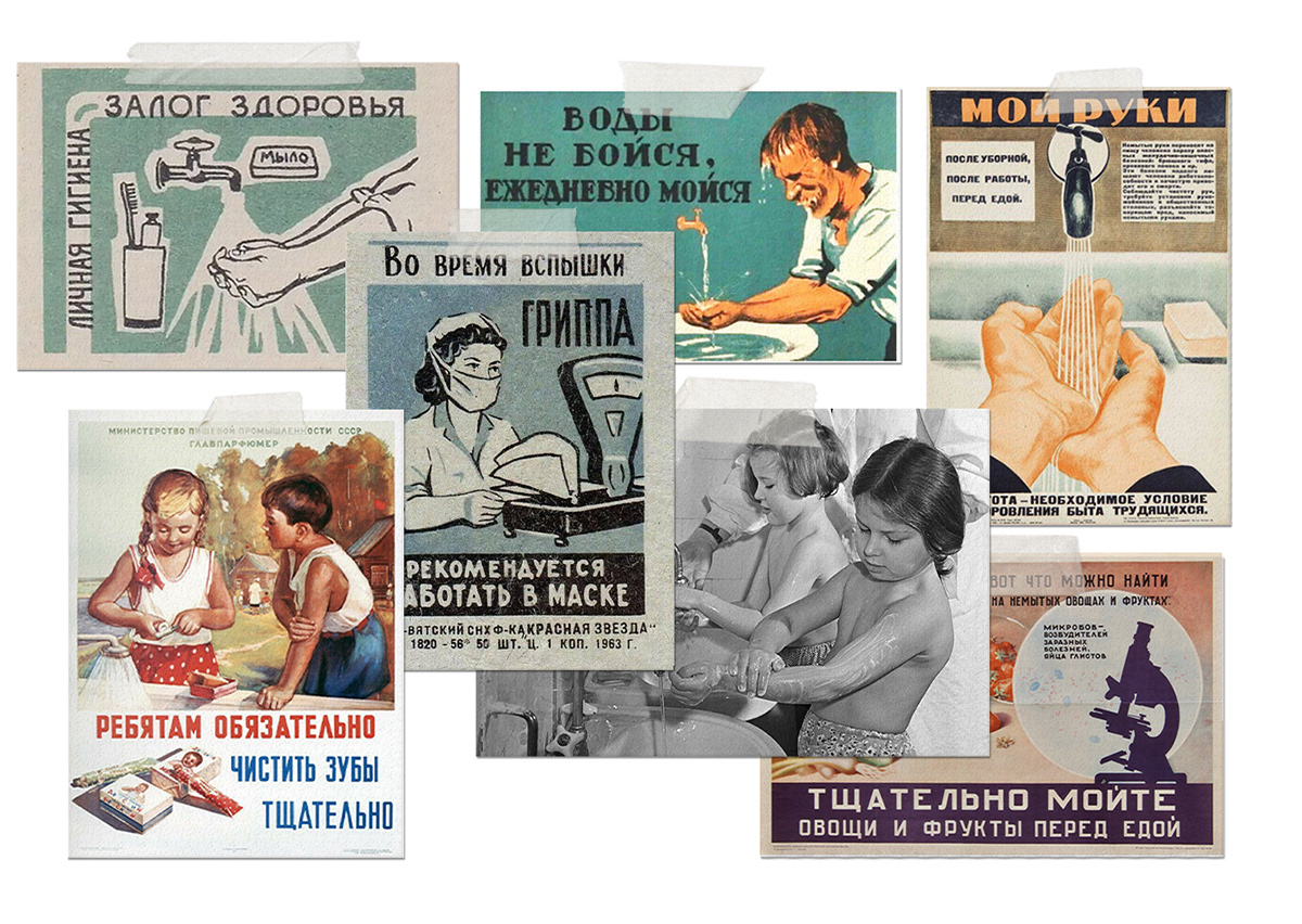
As a result, we decided to give the theme of hygiene an entertaining and educational tone. The museum should be understandable and attractive to its main audience — schoolchildren.
How we combined the stylistics of the Soviet era and elements of modernity
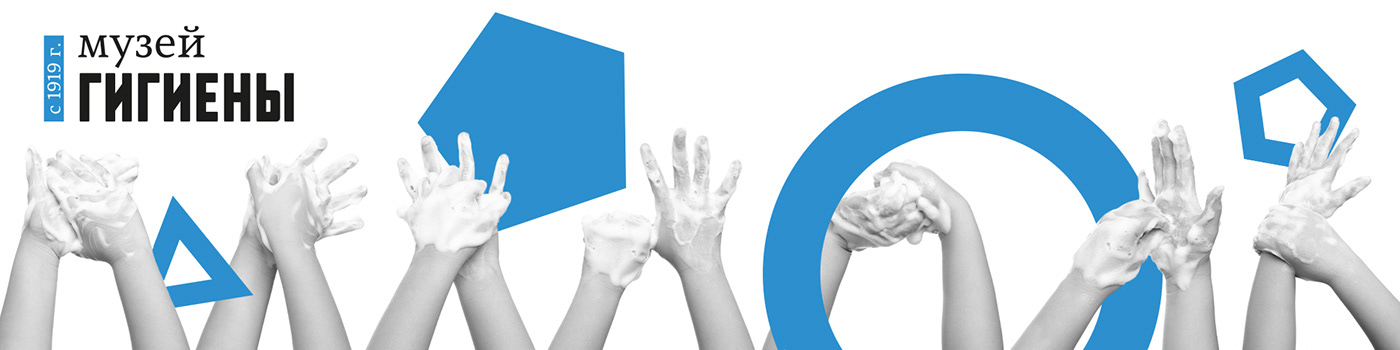
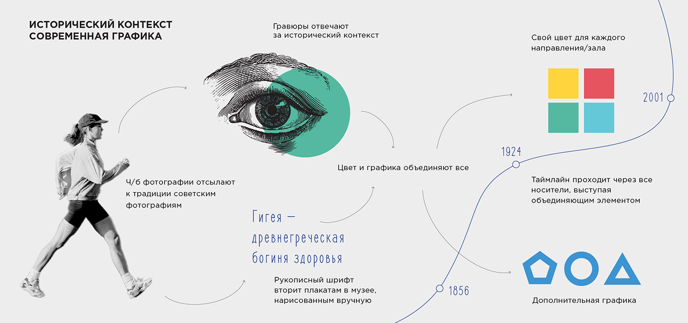
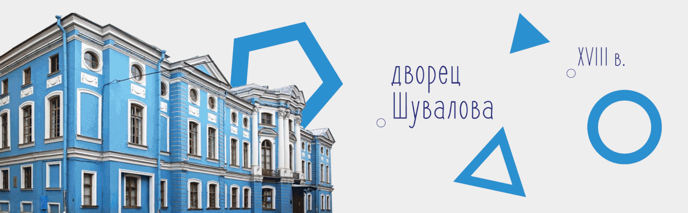
The museum was opened in 1919, so the logo we created is based on the newspaper and poster associations of the early 20th century. At the same time, it looks not old-school, but modern — due to the selection of fonts, their combinations and layout, as well as due to color. We decided to make the main color bright blue — the color of the historic building on Italianskaya Street, where the museum is located.
The identity is based on a combination of three visual lines — engraving, black and white photography, and active geometric graphics.
As a result, we get interesting key images that combine characteristic elements of the last century and the present, which gives a sense of the connection of time, a kind of bridge between epochs.

We have fixed a pictogram and a color for each theme of the exhibition. This will come in useful for navigation within the museum, for identifying specific halls, and for informational materials. We add additional graphics to each pictogram, which are combined with its form.


The visual attributes are supported by a cool, easy-to-remember slogan that tells how to wash your hands properly and thus promotes the theme of hygiene: "Wet, Soap, Rub, Rinse, Dry."


In the hygiene museum's corporate style, we reflected a connection to the first Soviet decades, when hygiene promotion was at its peak. At the same time, we made the visual and verbal language of the museum relevant, vivid and active in order to simplify its perception by the target audience.


Creative team
art director
Irina Shmidt
designers
Tatyana Savchuk, Irina Shmidt, Ekaterina Starodumova
strategist
Irina Mokrousova
marketer
Maria Megrabyan
project manager
Marta Bekker